How to Visualize Customer Data: Tips and Tools
Modern businesses thrive on data to make informed decisions. It’s much easier than before to track product sales and customer behavior. However, there are two problems. The first is that the torrent of data can lead businesses to data fatigue. The second is that humans aren’t naturally wired to grasp numbers quickly.
Given these, you must implement a method of making sense of all the data you gather. An effective way of turning your collected data into actionable insights is through data visualization.
Businesses use data visualization to analyze the needs of their customers better, spot emerging market trends they can capitalize on, and identify more business opportunities. But it’s more than that.
This article discusses why we visualize data and the tools to visualize data.
Why Do We Visualize Data?
Insights are often hidden in spreadsheets, and it’ll take too long to find them manually. Visualizations help make the implications of your data much more understandable.
The other benefits of visualizing data are the following:
To identify correlations in variables
Variables in a data set have the potential to influence one another. However, it isn’t always obvious which variables are correlated or have a relationship without using tools to visualize data. The correlations you identify can form the basis of your business decisions.
For instance, in the 20th century, many Americans refused to believe in the adverse effects of smoking a cigarette, specifically its relation to being the cause of lung cancer. However—as is known now—they were wrong.
Below is a graph that illustrates the point succinctly:
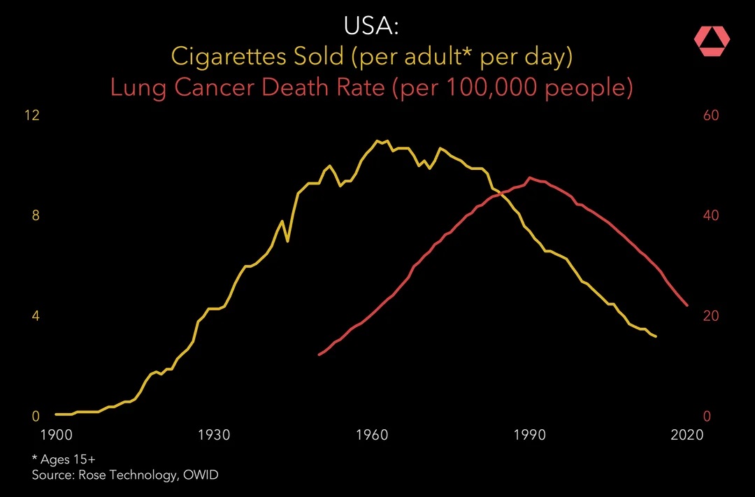
Source: Rose Technology
To look at value and risk metrics
It’s often difficult to grasp how risky or rewarding a decision will be for you. Knowing how to visualize data allows you to reveal your decisions’ potential risks or rewards.
For instance, you’re deciding on a location to open your store. Instead of writing a massive spreadsheet of all possible places, you can create a heat map to quickly glimpse how popular certain areas are, allowing you to gauge the potential success of one site and the failure of another.
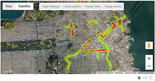
Source: Google
Another example would be using scoring APIs to gauge how trustworthy customers are, helping you focus on the valuable members of your audience.
To examine trends and the market
The simplest answer to the question, “Why do we visualize data?” is that data visualization provides an easily digestible way of making sense of market trends through color, shapes, charts, and graphs.
A common example is using a line chart to monitor the stock market. It provides you with what you need to know about the state of the market at a glance.
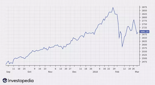
Source: Investopedia
Visualizing your customer data paints a clearer picture of what’s losing or gaining popularity and what types of customers you can tap into.
Data visualization provides many benefits, but it depends on how you visualize your data.
How to Visualize Customer Data
Misunderstanding what your data tells you can cause you to waste resources. Thanks to modern tools, gathering data is easy; interpreting it is another story. Below are a few methods and tools to visualize data, helping you analyze information accurately and turn them into actionable insights.
Define the main points of customer experience
How do your prospects turn into customers? How do your customers become brand advocates? You can answer these questions by plotting your customers’ path from kicking the tires to making a purchase.
Understanding how to visualize data from your customer journey—including touchpoints and departments they interact with—will help you become aware of where to optimize your efforts.
Choose a format that represents your company’s goals better
Some tools to visualize data include infographics, heat maps, bar graphs, and pie charts, among many others. Each has a distinct purpose.
For instance, if you want to learn which portion of your website is eye-catching, a heatmap could give you more customer insights than a pie chart. Some scatterplots show every data point, helping you visualize every input’s behavior, while histograms only show statistical summaries.
The right tools to visualize data will depend on what you’re measuring and why you’re doing so.
Aim for efficient visualization
Many tools online help you visualize data, even when you aren’t an information designer. However, knowing how to use these tools to visualize data is still essential. Following design principles can elevate your message and make insights much more evident.
Efficient visualization is better for your audience—whether pitching to upper management or educating your customers. Color is among your many tools to visualize data that convey information efficiently. You can color losses and decreases in red and gains and increases in green to quickly tell negative or positive outcomes.
Additionally, words written in larger or thicker sizes are often considered more important than others. You can use this to create contrast and emphasize certain points.
Don’t over-explain
Over-explaining defeats the purpose of data visualization; you’re meant to make information more digestible, not overwhelm your audience. It’s much better to keep your data visualizations simple and write your copies and descriptions succinctly and in plain language. These help remove clutter and help you get straight to the point.
Understand Your Data to Understand Your Customers
Data is vital for successful business decisions, but many companies struggle to make sense of it. Visualization is necessary to communicate insights, identify risks, rewards, and opportunities, and understand customer behavior better.
If you aren’t sure how to start visualizing your data, consider working with Inquiro.
Inquiro is a platform specializing in data visualization, using essential points that help you arrive at valuable insights. Our 360º Customer Dashboard allows you to understand your consumers more deeply. Contact us today to request a demo of the platform.